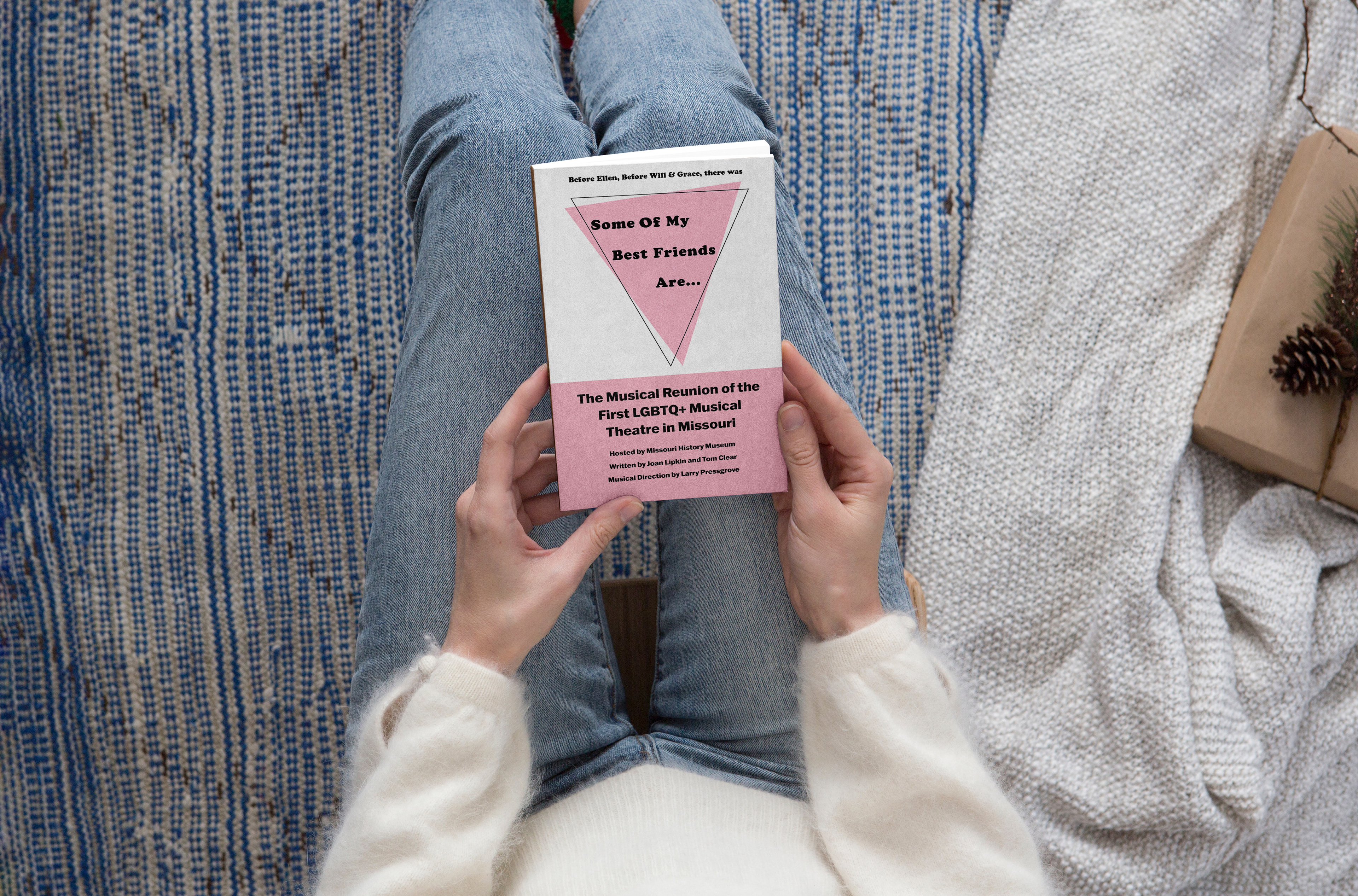
Some Of My Best Friends Are… was the first piece of musical theatre that talked about LBGBTQ+
issues in 1989. A year of monumental events, this play was no different. Covering topics labeled at the
time as deviant, the play challenged social stigma. Created by Tom Clear and Joan Lipkin this play was a
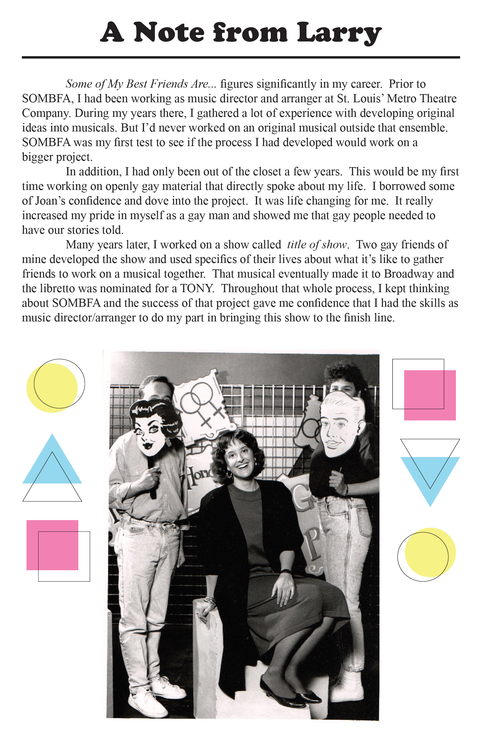
massive success for several months in a row. Thirty-three years later the Musical had a Reunion at the
Missouri History Museum, and I was lucky enough to be a part of it under the tutelage of Joan Lipkin and
some other original cast members!
issues in 1989. A year of monumental events, this play was no different. Covering topics labeled at the
time as deviant, the play challenged social stigma. Created by Tom Clear and Joan Lipkin this play was a
massive success for several months in a row. Thirty-three years later the Musical had a Reunion at the
Missouri History Museum, and I was lucky enough to be a part of it under the tutelage of Joan Lipkin and
some other original cast members!
Some Of My Best Friends Are… covers what it was like to be gay in 1989 with the misconceived
notions people had about gay people, and how challenging it was. They faced difficulties finding
sponsors, ads, and even actors to play these characters out of fear of the stigma surrounding it. The
reality of being gay is that there is no deviancy, there is no agenda. Gay people are simply people who
are attracted to the same gender. There is no predatory intention that encompasses all gay people.
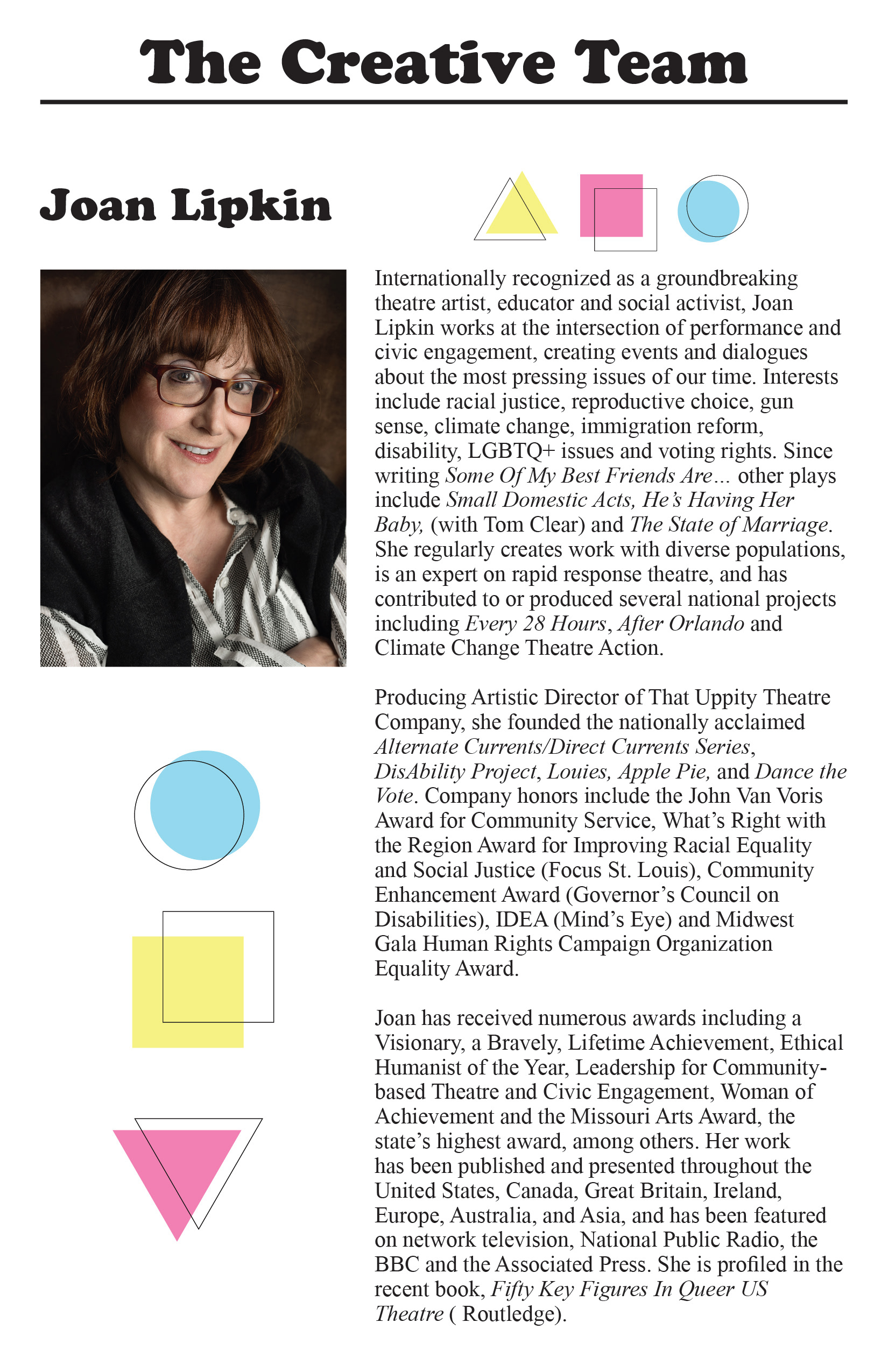
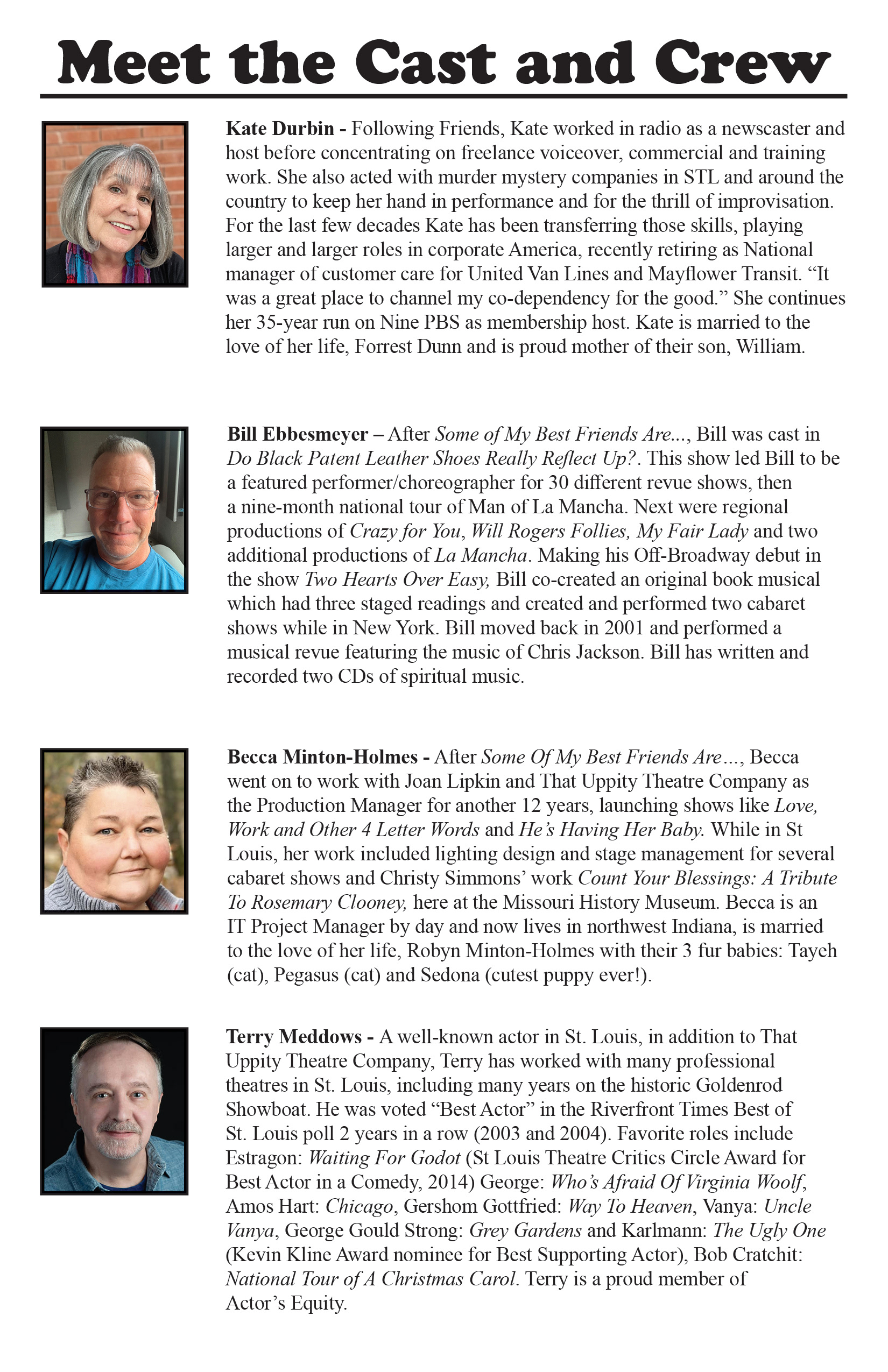
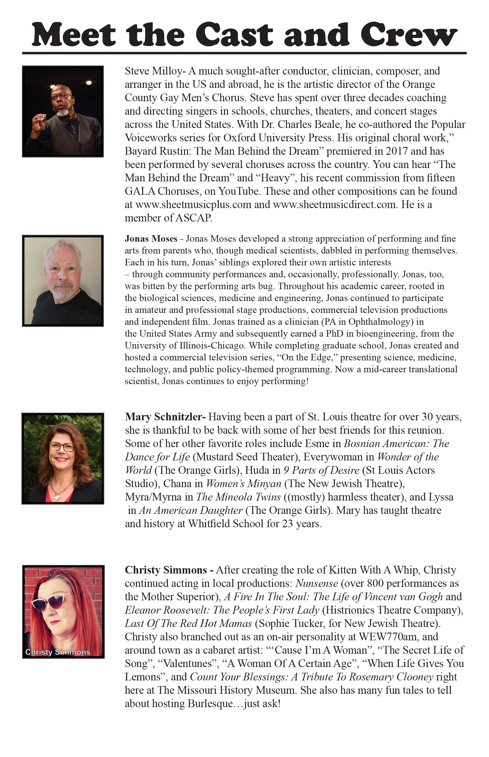
For this project I created a plethora of content. I did a redesign of the logo for a more modern
look while remaining true to the identity of the musical. I created a program bill, multiple social media
posts, and more! Some of my work is also available in the permanent archive of the
look while remaining true to the identity of the musical. I created a program bill, multiple social media
posts, and more! Some of my work is also available in the permanent archive of the
Missouri History Museum in St. Louis!
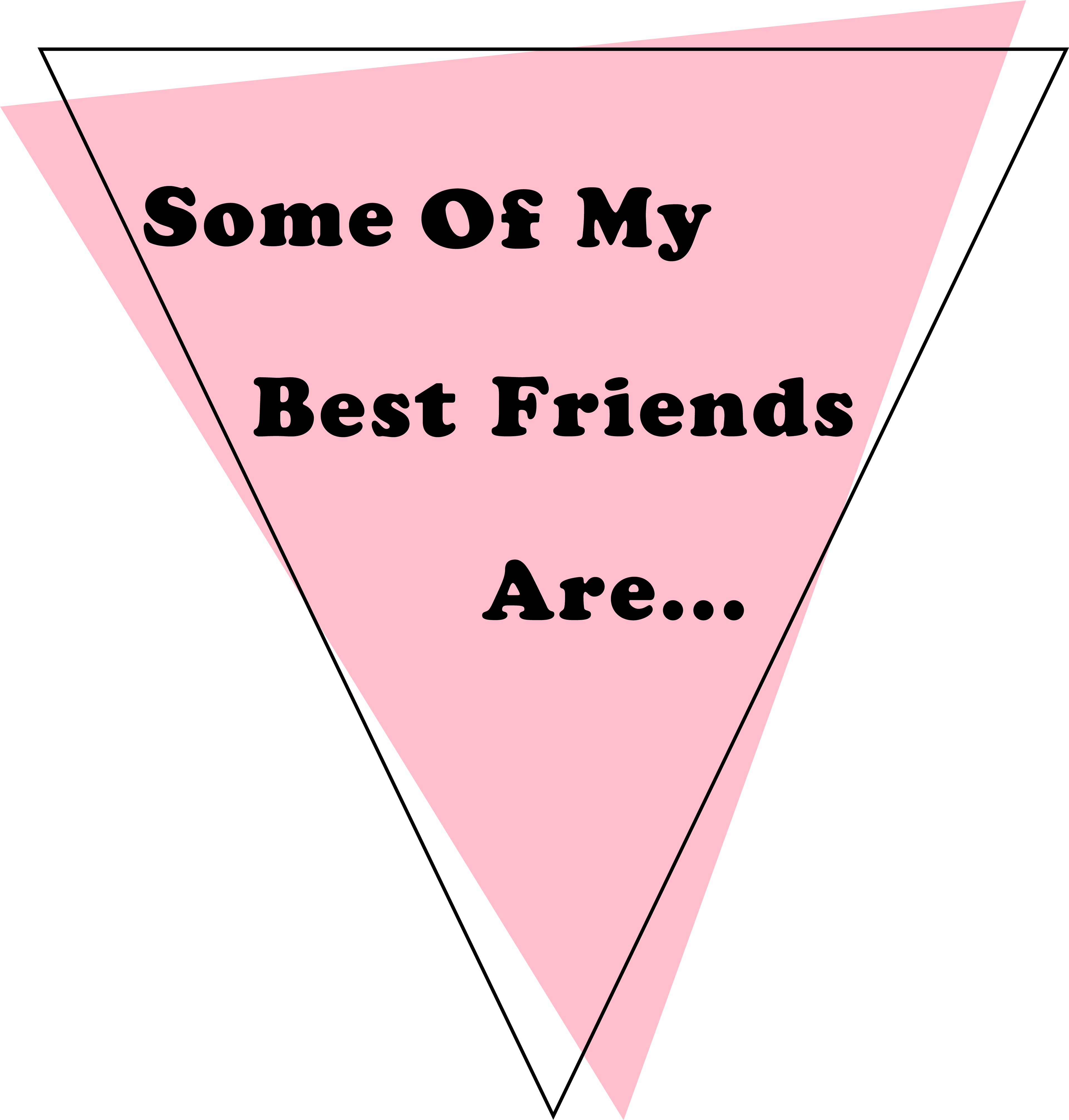
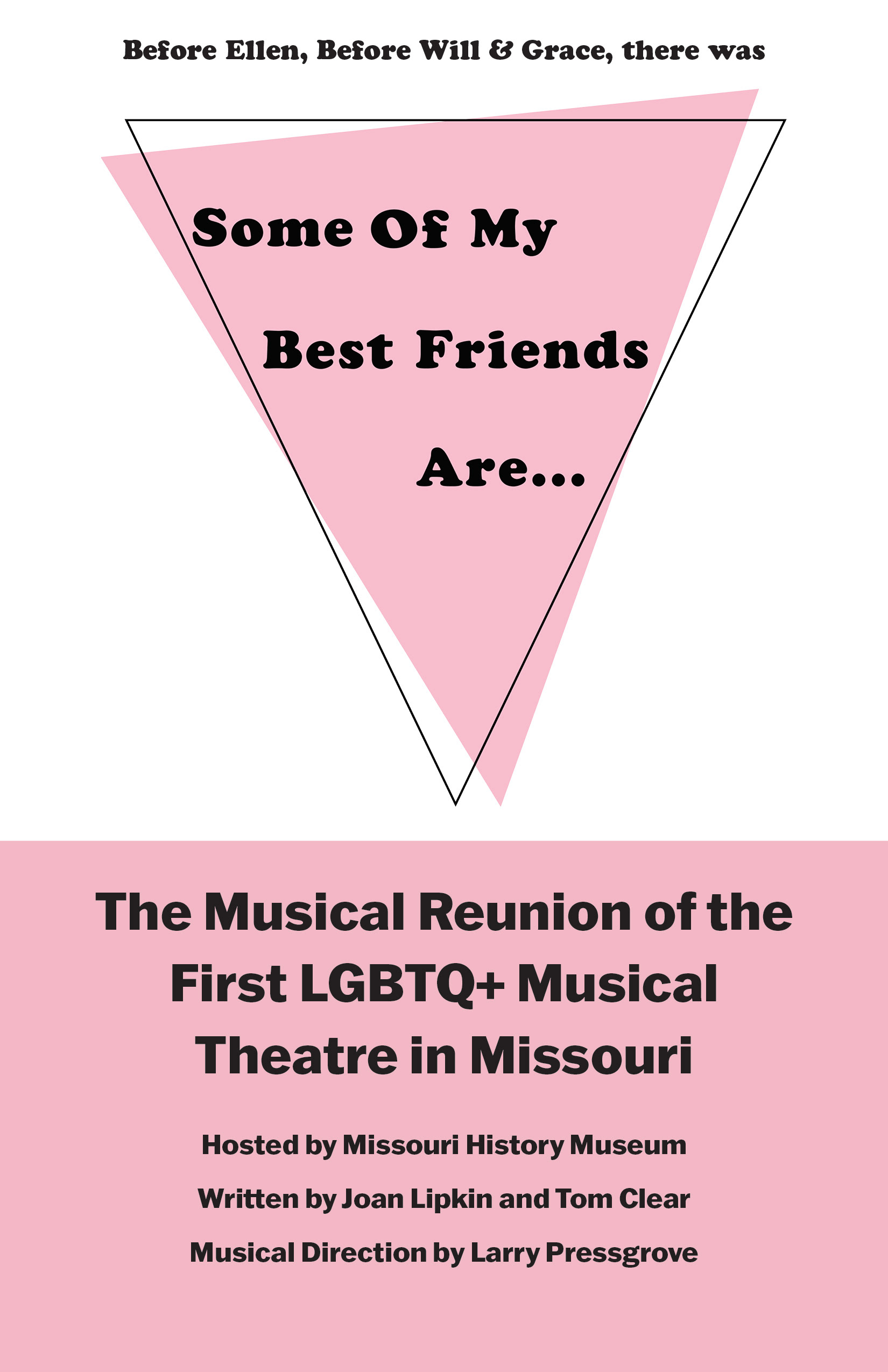
Logo Redesign
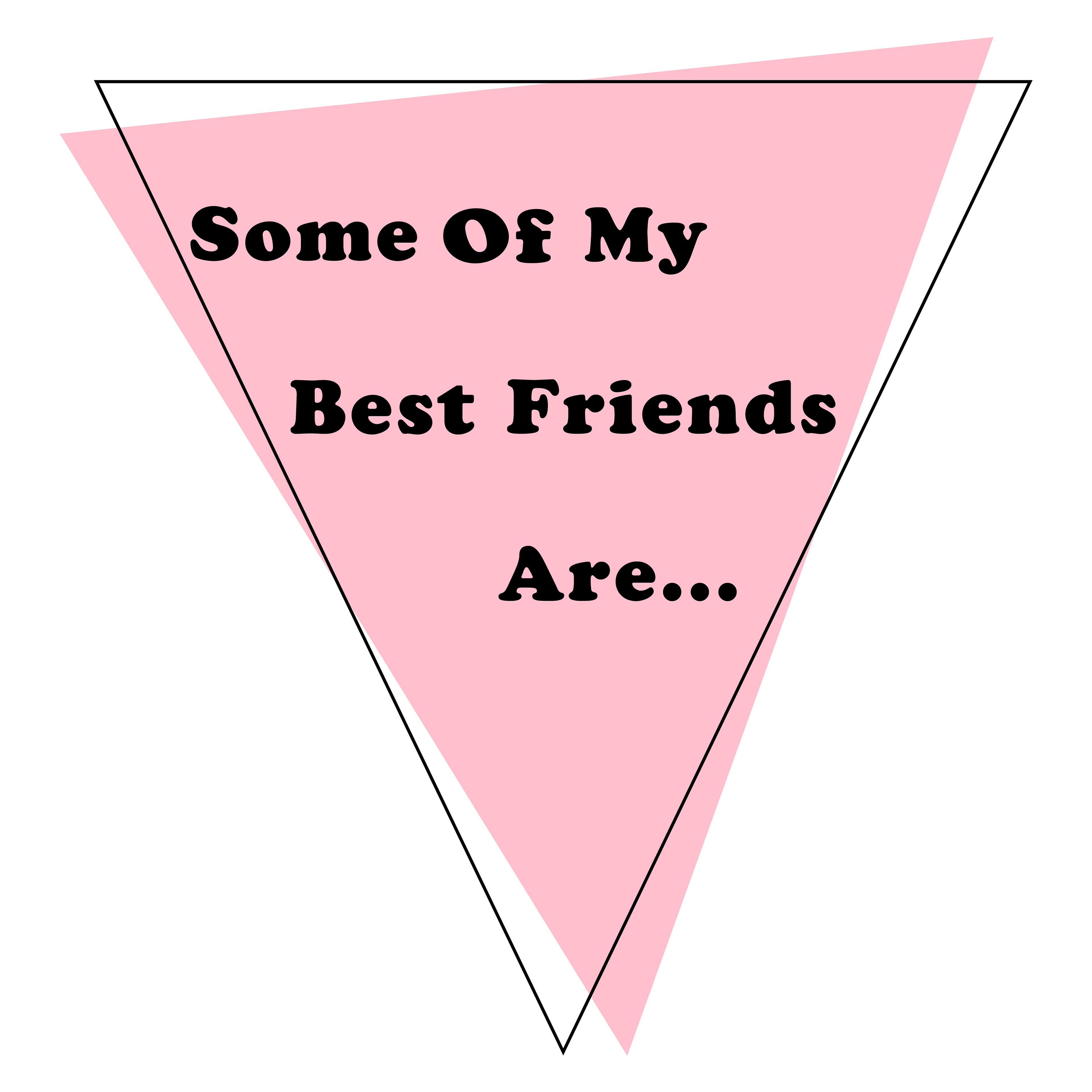
The logo redesign was something that had to be done, as no one had a file that resembled the
original logo, and Adobe was relatively new to the industry at the time. To recreate the logo, I took the
general idea of using the pink triangle and the black triangle that was behind it, but instead used a black
line for a more interesting and dimensional graphic. I used the original font, Cooper Black, for the title
that was placed within the pink triangle.
Program
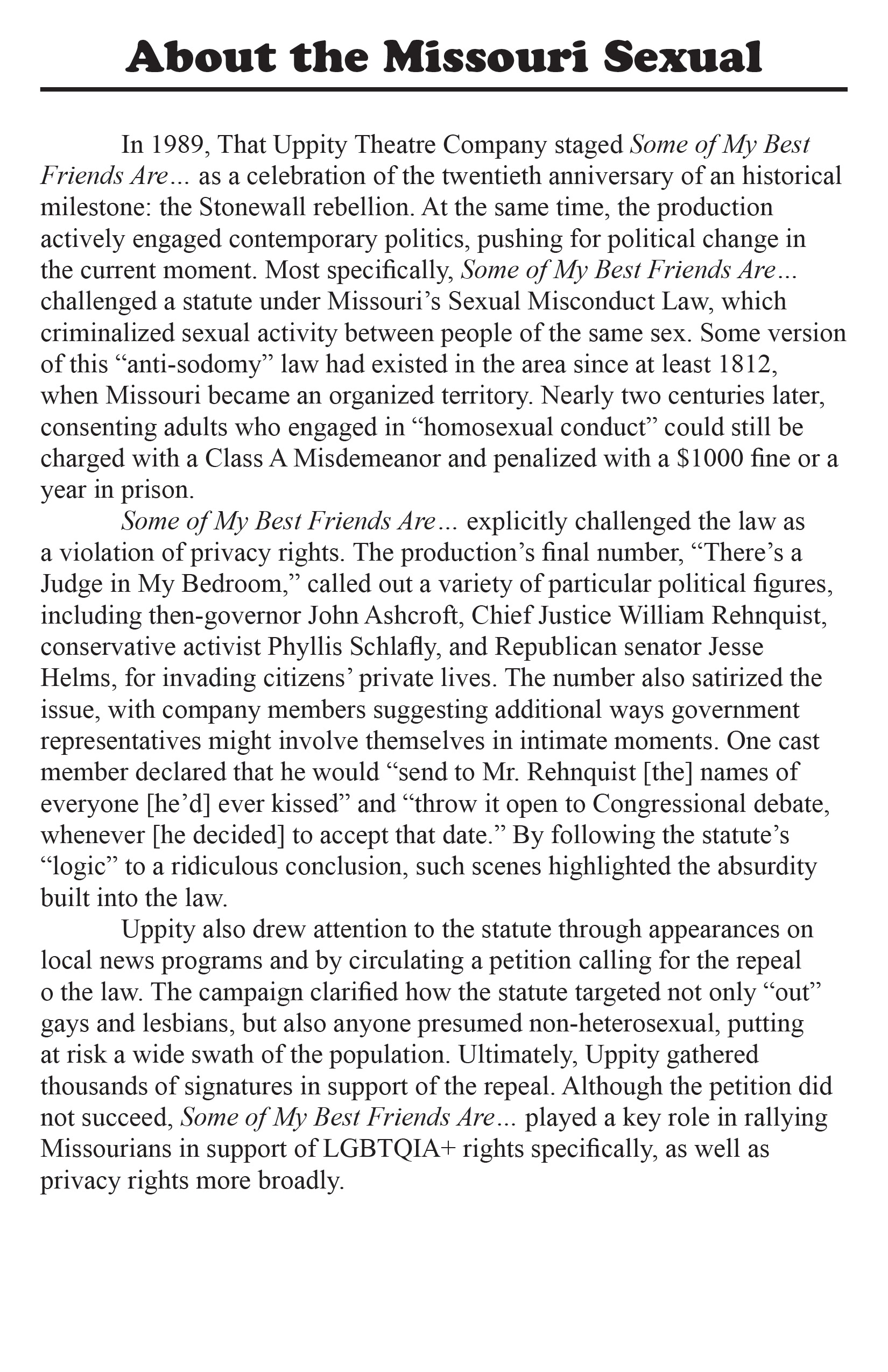
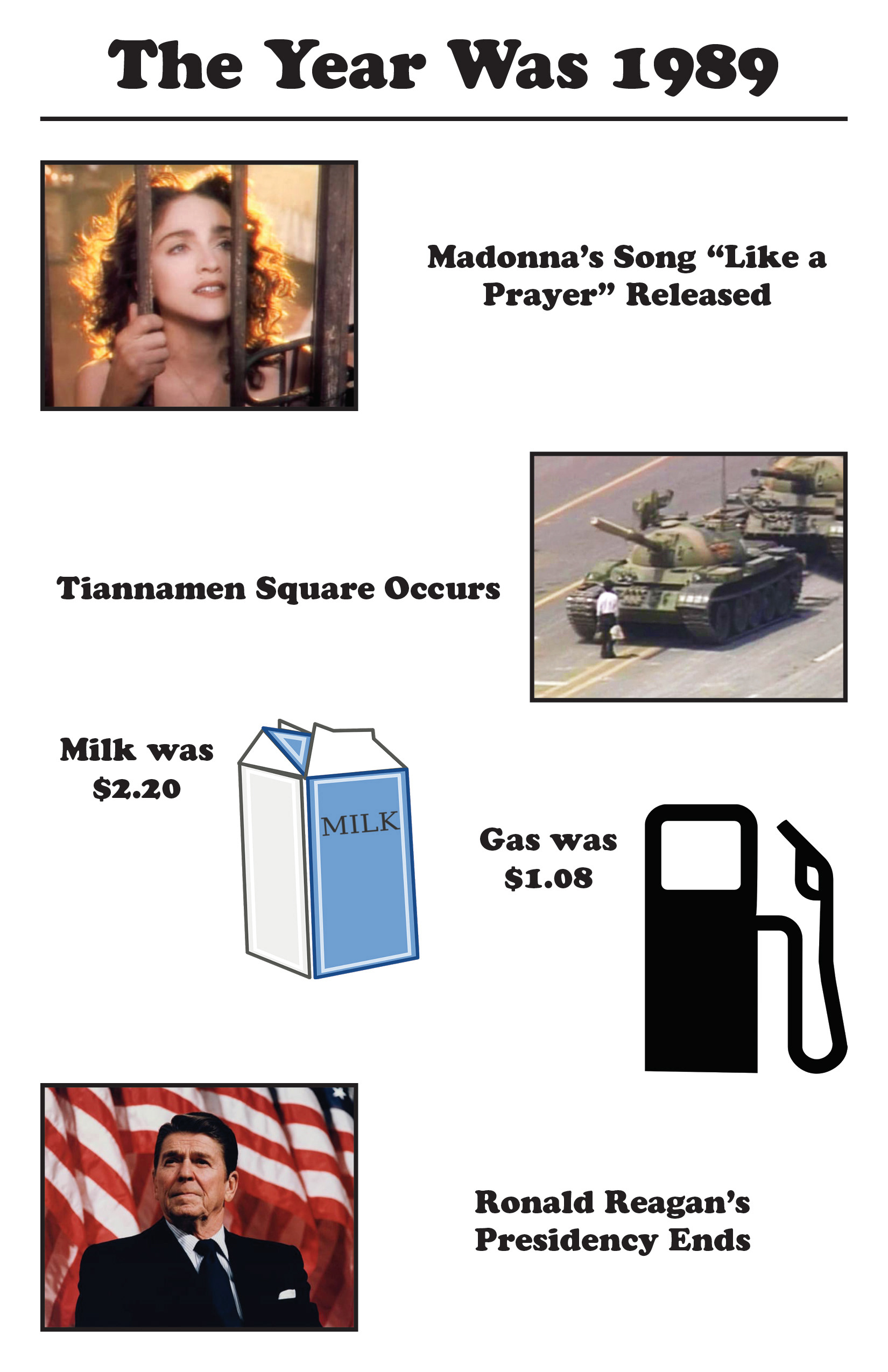
The program for the reunion was something Joan wanted to encompass the list of cast
members, the musical producer, a message about the Missouri Sexual Misconduct Law that was
important to the time, and some general information about the year of 1989. It was a huge year in
political events and pop culture. Several people who had seen the original Some Of My Best Friends
Are… performance returned to see the reunion!
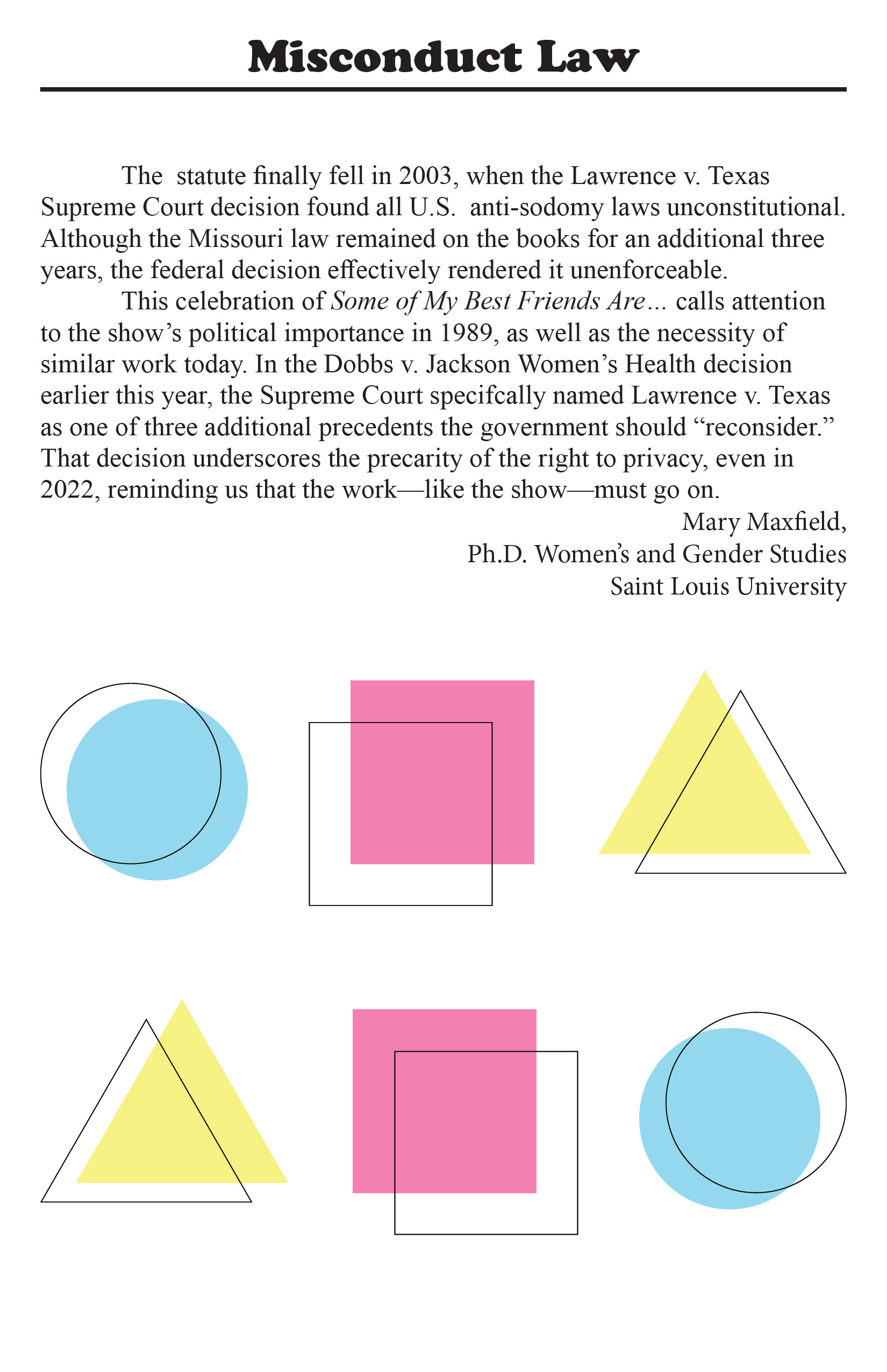
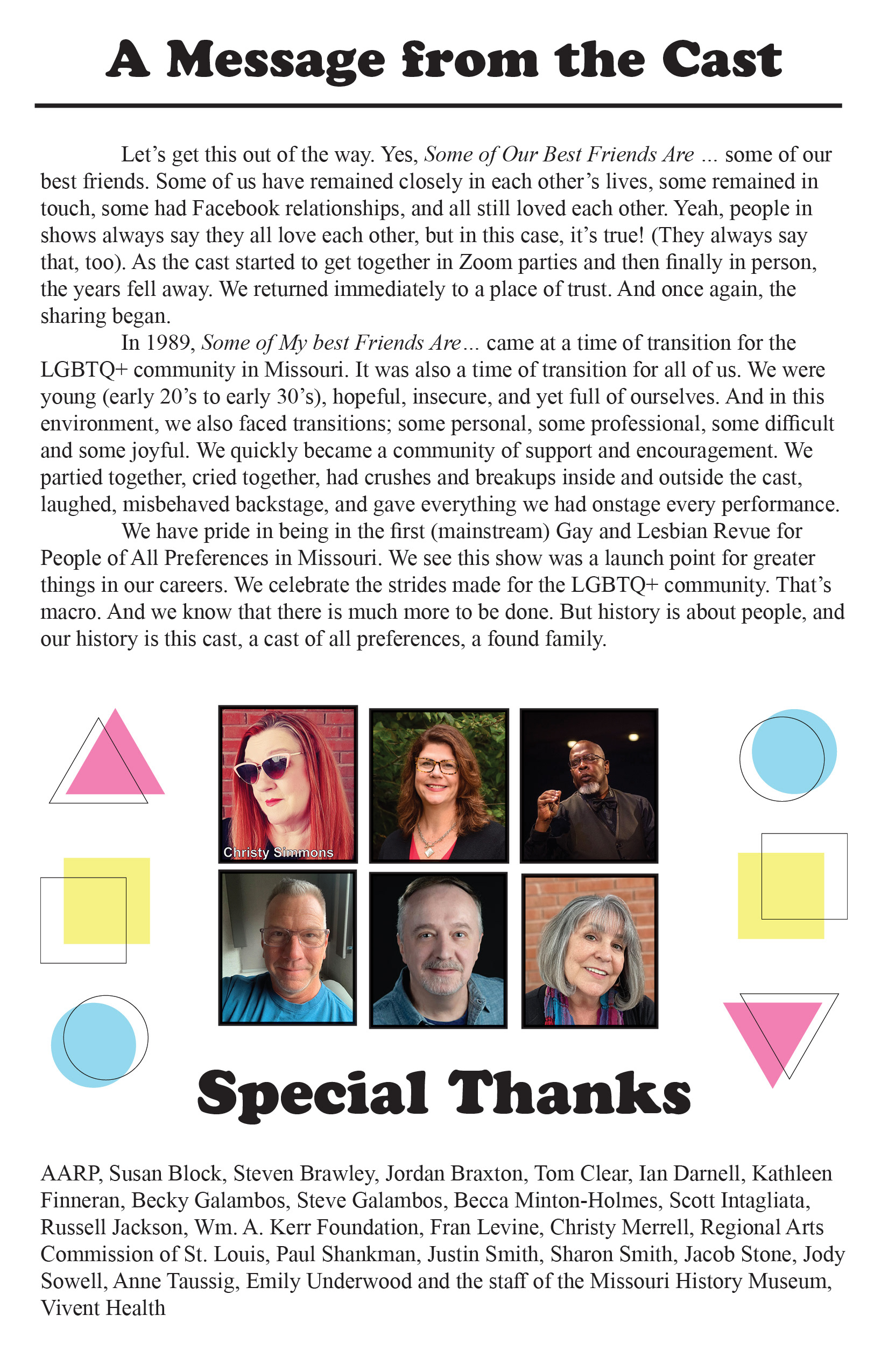
One of the design elements that fills up select empty space is reflective of a playful nature,
taking primary colors more in line with the pastel pink that was used in the logo redesign. These shapes
reflect the logo in the design with another triangle, square, and circle in various colors in the same
palette. While SOMBFA… is an important piece of musical theatre, it is not without its fun moments.
These shapes and colors were scattered throughout the program to give it the same flavor of fun the
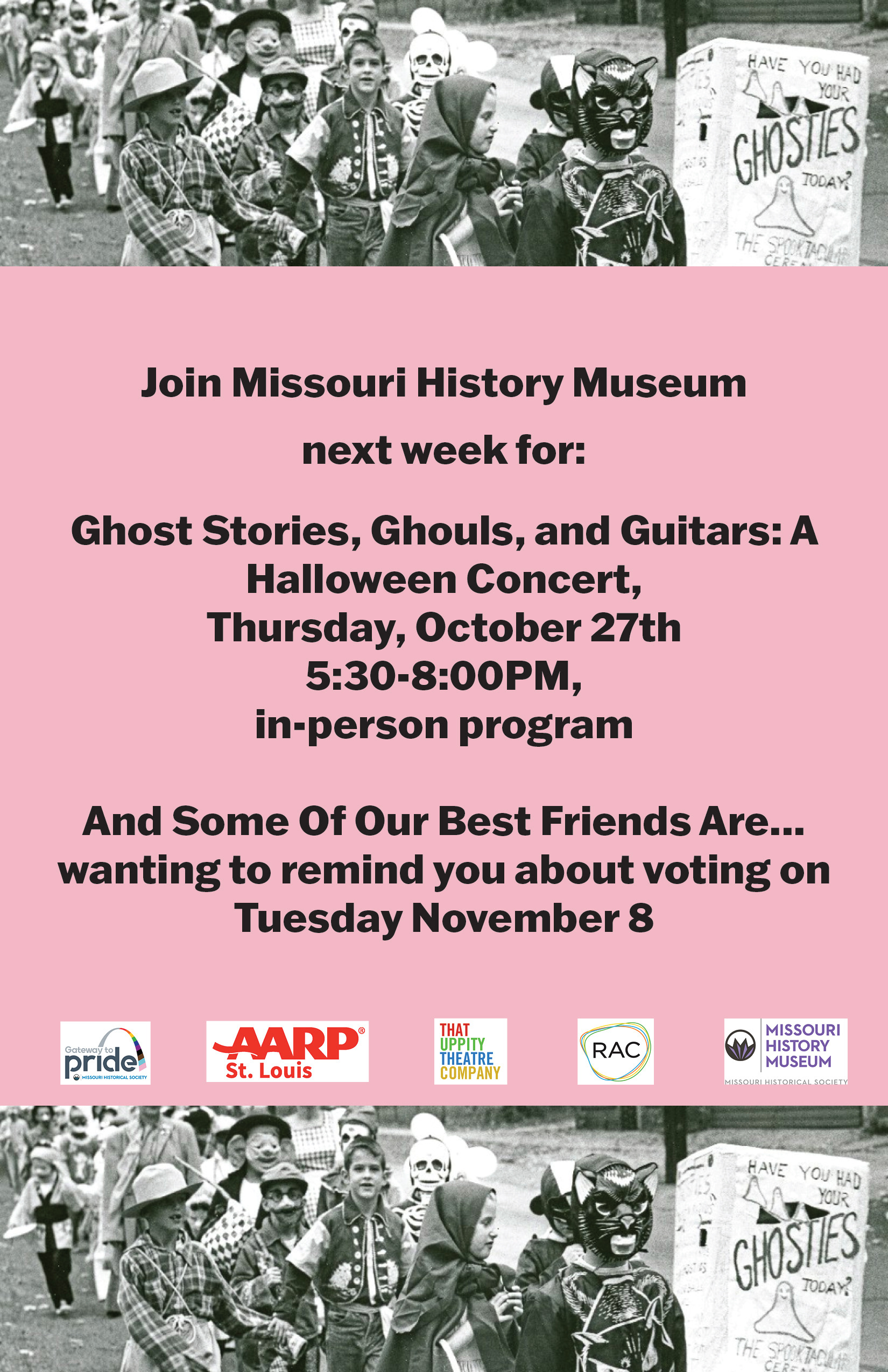
play has upon viewing. The back cover of the program includes sponsors and additional upcoming
events at Missouri History Museum for Halloween.
Program Insert

Handout Fliers

We had some handout fliers to help spread the word about SOMBFA… and this Save the Date flier is the beginning of the social media template. I used the exact pink of the triangle, cooper black, and a complimentary font that would allow for the basis of the social media graphics.
Practicing Safer Sex
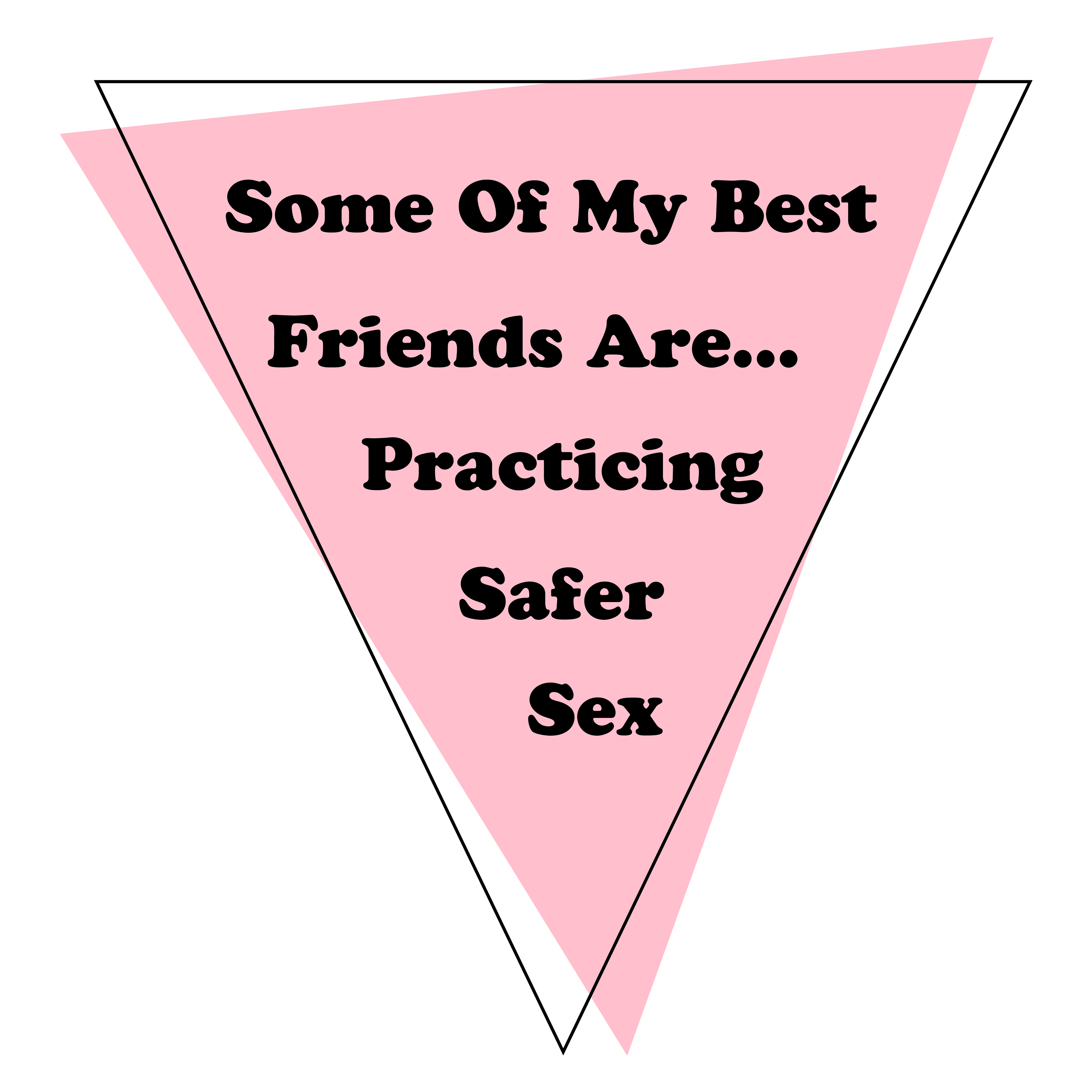
We also had a condom package insert with the logo and some words “Some of My Best Friends Are…
Practicing Safer Sex”
Practicing Safer Sex”